
25+ Powerful SATs Pie Chart Questions: Essential KS2 Guide & Practice Tips
Sats pie chart questions ask you to read a circle divided into sections and work out amounts, fractions, percentages, or angles from it and most children lose marks not because the maths is hard, but because they misread what the chart is actually showing. I’ve marked hundreds of Year 6 reasoning papers, and the pattern is always the same: the child understands percentages fine, they just don’t connect the slice size to the real-world total.
This guide walks through every question type that shows up in KS2 statistics papers fractions, percentages, angles, comparison charts, and drawing with the exact method examiners expect. By the end, you’ll know how to approach any sats pie chart question without guessing, using worked examples pulled from real Year 6 Paper 3 reasoning-style questions.
Common Types of Sats Pie Chart Questions
KS2 papers reuse a small set of survey scenarios again and again class food or potato preferences, tree-count surveys in a park, travel-to-school methods, pocket money spending, sports results, and shop sales of books, CDs, and DVDs. Recognising the scenario instantly tells you what units the answer needs.
Every version of a sats pie chart question tests the same underlying skill: converting a visual slice into a number. Whether the scenario is trees, teenagers, or teams, the method doesn’t change find the total, find the fraction or angle of the slice, then multiply. Scenario familiarity just speeds up reading time under exam pressure.
How to Work Out Fractions and Percentages from a Pie Chart
The first thing to find in any sats pie chart question is the total number of people or items surveyed it’s almost always given in the text just above or below the chart. Once you have that total, a labelled fraction or percentage on a slice tells you exactly what portion of that total the slice represents.
To turn a percentage into an actual number, multiply the total by the percentage as a decimal 25% of 32 children means 32 × 0.25, which equals 8. For fractions, multiply the total by the fraction directly. This single calculation covers the majority of one- and two-mark pie chart questions in KS2 SATs papers.
How to Calculate the Angle for a Pie Chart Segment
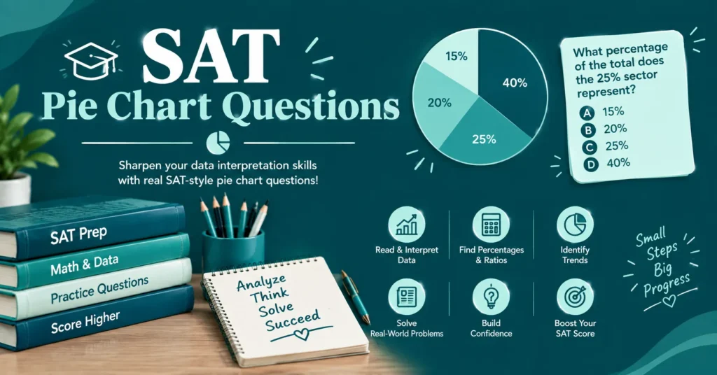
Angle-based sats pie chart questions ask you to work backwards from a slice to a value, or forwards from a value to a slice’s angle and both directions rely on one fact: a full pie chart is always 360 degrees. If you know a slice’s angle, divide it by 360 to get the fraction of the total it represents.
To go the other way finding an angle when you know a category’s count divide that count by the total, then multiply by 360. A 120-degree segment, for example, always represents exactly one third of the whole survey, regardless of what the pie chart is actually measuring.
True or False / Tick and Cross Statement Questions
Many sats pie chart questions don’t ask for a direct calculation at all they give four or five statements about the chart and ask you to tick the correct ones and cross the incorrect ones. Each statement usually hides one small calculation, so treat every line as its own mini fraction-or-percentage question.
The trap in these questions is assuming a bigger-looking slice means a bigger number without checking the actual totals behind two different charts. Always calculate before ticking a 40% slice of a small survey can easily be a smaller real number than a 25% slice of a much larger one.
Comparing Two Pie Charts in Sats Reasoning Papers
Higher-mark sats pie chart questions often show two pie charts side by side commonly two schools, two years, or two teams and ask which statement about them is true. These questions are specifically designed to test whether pupils confuse percentage size with actual quantity.
Work out the real number behind each relevant slice in both charts before comparing anything, since the two charts may represent completely different total group sizes. This step alone resolves nearly every “which statement is true” comparison question that appears in Year 6 reasoning papers.
Estimating Values from a Pie Chart
Some sats pie chart questions deliberately give a chart without exact gridlines or precise percentage labels, asking pupils to estimate a fraction or amount instead. These questions reward sensible rounding is the slice closer to a quarter, a third, or a half of the circle?
Round the visual slice to the nearest simple fraction, then apply that fraction to the given total using the same multiplication method as an exact question. Examiners accept a reasonable range of answers here, so a confident estimate using clean fractions beats an over-precise guess.
Drawing a Pie Chart from a Table of Data
Less common but still tested, some sats pie chart questions give a table of category totals and ask pupils to calculate each angle and draw the completed pie chart themselves using a protractor. This reverses the entire process covered above.
For each category, divide its count by the survey total, multiply by 360 to get its angle, then plot that angle from the centre using a protractor before moving to the next category. Getting one angle wrong throws off every following slice, so working systematically top-to-bottom matters more than speed here.
Worked Example: A Full Sats Pie Chart Question Step by Step
| Step | Action | Example |
| 1 | Find the total | 32 children surveyed |
| 2 | Read the labelled slice | 25% like mashed potatoes best |
| 3 | Convert percentage to decimal | 25% = 0.25 |
| 4 | Multiply by total | 32 × 0.25 = 8 children |
| 5 | Check against the statement given | “10 children like chips best” compare separately |
This five-step method applies to almost every sats pie chart question regardless of the survey topic, because the underlying maths total, portion, multiplication never actually changes between papers.

Sats Pie Chart Question Types at a Glance
| Question Type | What You’re Given | What You Calculate |
| Fraction/percentage to amount | Total + labelled slice | Actual number in that category |
| Amount to angle | Total + category count | Angle in degrees |
| Angle to amount | Total + given angle | Number in that category |
| True/false statements | Full chart + total | Verify each statement individually |
| Two-chart comparison | Two charts, two totals | Real numbers behind each, then compare |
| Estimation | Chart with no exact labels | Nearest simple fraction, then amount |
| Drawing | Table of raw data | Each angle, plotted with a protractor |
Conclusion
SATs pie chart questions can seem challenging at first, but they become much easier once you understand how to read percentages, compare sections, and use the information provided in the chart. Regular practice helps you work through these questions more quickly and avoid common calculation mistakes.
Focus on identifying what the whole chart represents before solving for individual parts or comparing categories. It is also helpful to estimate your answer before calculating it fully, especially when working under SAT time limits. With consistent practice, pie charts can become one of the more manageable question types on the test. Keep practicing different examples, and you’ll build the confidence and accuracy needed to tackle them successfully.
FAQs
Author

Hi, I’m Alex, and I enjoy learning through quizzes, trivia, and interactive questions. I love discovering new conversation starters, relationship topics, and educational challenges. This website is my go-to place for fun, practical, and reliable question-based content. I’m always excited to learn something new and share it with others.